Monday, October 18, 2010
Polar Bair
I love street art, be it graffiti (well-done pieces of course), tree stump carvings, pavement chalk drawings, large scale sculptures, etc. I just love it. I love watching people make it, or just seeing it when it's finished and wondering how it got there. There's one in particular I stumbled upon quite a while ago and was brought to mind yesterday when I was thinking of blog topics.
Joshua Allen Harris is a street artist who brings new life to the streets of New York through his innovative art. By using elements of the street, mainly plastic garbage bags that you might find littering the sidewalks and marrying it with a monotonous ingredient of city life, the subway grate, he manages to breathe life into his creations. I think there are so many ways to interpret the possible social and environmental commentaries that he could possibly make with such a simple yet brilliant use of materials, but I find that at its best it's just enjoyable to see it come to life and to watch the reactions of the viewers around. I only wish that the first time I had seen it was not through a video but in person to have experienced it myself.
On a deeper level, it's quite obvious that the possible environmental message that it could articulate was also evident to globalwarming.com as the artist's footage was used for one of their awareness commercials. The main message was to encourage city dwellers to ride public transportation as opposed to driving which, is an effective way to use the piece. I think it could also demonstrate how our city lives are so busy that we often forget about what is around us, whether it's beautiful or not. We see the subway grate as a subway grate and litter as litter, just apart of our background, but Harris' installments force us to pause and see it in a new way, to find beauty and opportunity in anything.
To see more of his work, visit his YouTube site here.
Sunday, October 17, 2010
Project 1
Project one for Litho was done and handed in last week. I was planning on waiting until I received my printed edition back from my prof to share it on my blog but since I haven't gotten it back just yet I thought I would go ahead and show you the result of my sweat and tears this past month.
The whole process will involve two stages whereby, I hope to produce 2-3 editions of a series. My first edition has been accomplished along with the first stage. In case you're wondering 'what is an edition?'; I'm referring to the series of prints resulting from going to press with the litho stone. Usually you aim to print a specified number of identical prints. They are later numbered and the first should be the print that is the most like what you had intended your image to look like. As for what to expect for the following stages of my litho series, it will remain untold for now (although some friends have been divulged) and I will fill you in as I proceed.
I will however share that this series is dedicated to my loving and nurturing mother and this piece in particular is a representation of her. She was the one who always encouraged me to follow my heart and let me pursue my passions. She is a great source of inspiration and so I thought it would only be fitting that she take on a new life in my stone. I chose to personify her as a matryoshka (Russian nested doll) because matryoshkas were originally created in the likeness of a healthy and nurturing Russian peasant mother and her family. Although my mom is not Russian I found that it was a unique and interesting symbol for this subject. This symbol also lends itself to another aspect of my series which, will become more apparent when it is complete.
Within the image of the doll itself, I also incorporated personal qualities of my mother. Her almond shaped eyes and signature bangs were qualities I simply couldn't ignore. My mother was also the middle child of 6 kids represented by the six smaller circles on her headdress, herself included, and the bigger middle circle signifies hers and my grandmother's rested souls. The swirly designs on her dress depict her free-flowing beautiful spirit and the background wash illustrates her absence from the world.
love you, miss you.
 |
| Proofs from first attempt at going to press |
I will however share that this series is dedicated to my loving and nurturing mother and this piece in particular is a representation of her. She was the one who always encouraged me to follow my heart and let me pursue my passions. She is a great source of inspiration and so I thought it would only be fitting that she take on a new life in my stone. I chose to personify her as a matryoshka (Russian nested doll) because matryoshkas were originally created in the likeness of a healthy and nurturing Russian peasant mother and her family. Although my mom is not Russian I found that it was a unique and interesting symbol for this subject. This symbol also lends itself to another aspect of my series which, will become more apparent when it is complete.
 |
| Inked up stone |
love you, miss you.
Sunday, October 10, 2010
3 Things from this week
So I've decided that my goal will be to blog at least once a week. If I've got a full time gig then I will need to make time over the weekend, if not then I should blog daily. Now that I've said it, I'll have to keep myself accountable... or else someone else might call me out :D (you know who you are!)
Anyways, here are three awesome things I found this week.
UN: Elephants never forget
So that's not actually the title but I don't understand Spanish, so I don't know what the title of this illustration is. I do, however, love elephants and the thing I associate the most with elephants is their rock hard memory, something I quite envy. In any case here lies the work of a cute creator, an illustrator who can't seem to make anything not cute. I really like the flat yet dimensional work of Argentinian illustrator, Emiliano Quintana, and the sense of personality found in each character.
DEUX: mmm eggplant
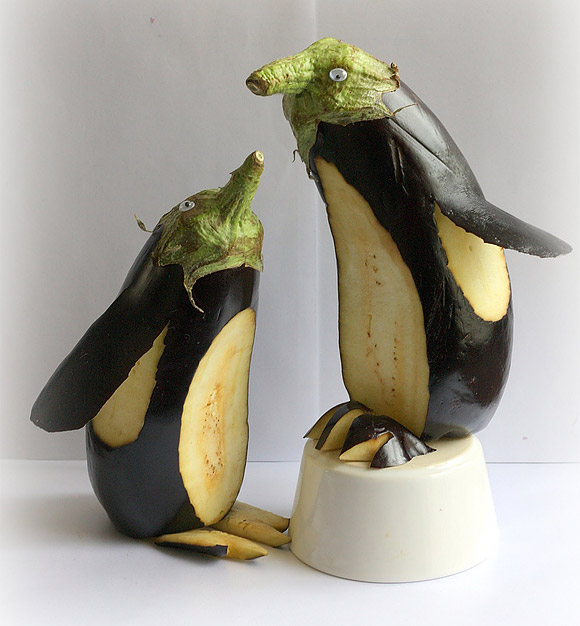
Aubergine Penguins by Dmitry Utkin are penguins made from eggplants, they're awesome. What more do I need to say?
TROIS: G's are hot
If you know me at all, you'd know I'm a type nerd, not quite as big as others but I do love type. Having said that, lowercase g's are one of my favourite characters :) so having come accross this beautifully developped letter g from a beautifully designed display font called Ogaki by Áron Jancsó was like spotting a celebrity.
Sorry about before, but the images aside from the elephant illustration are now embedded
Saturday, October 2, 2010
Litho
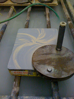
Every week as my prof demos the process of lithography printmaking, I only realize more and more that it's as hard as a rock! (both figuratively and literally) Every step is incredibly involved and laborious, but it is without a doubt, a labour of love :)
 |
| My stone being grained :) |
I think what I like so much about it is how challenging it is. Being a graphic designer today heavily involves a computer, shortcuts and all, which is convenient considering the tight deadlines that the industry thrives on. Everything needs to be pumped out according to multiple schedules; the client, the printer, the season, the event, the installers, or the designers, they all have a schedule that the process of design must adhere to. This means that more often than not, the art of design can easily get lost in translation.
I've always looked at printmaking as a way to go back in time and learn where all the photoshop effects and illustrator tools originated from. Old school processes can help to learn about how to manipulate these tools, but better than that, it allows you to return to the fundamental Art of graphic design. And plus I miss creating things just because I want to. This is among the many reasons why I decided to take a post graduate minor program at OCAD for printmaking.
 |
| Drying ze stone with medieval fan |
Although Litho wasn't originally on the top of my list, it was the only class available to me at the time I registered, but I am so excited to be able to learn this art form. In my first class Lauren, my prof, was explaining to us that, the huge slabs of limestone that we will be labouring over for the next few months, are easily decades older than us. They are the same stones that the printing presses used to use to publish newspapers and is also the same material that slaves has spent years stacking together forming pyramids in Egypt that still stand proudly today after so many centuries. It's amazing, even just to imagine the life my stone may have had and all the prints it had created before I claimed it for the semester.
I even like how mysterious it all is. once you've grained away layers of the stone to erase the previous image, you draw on it with greasy materials then etch your image into the pores of the stone by applying chemical processes to it. This will tell the stone where to take ink and where to repel it. It's like breathing art into a stone and bringing it to life, allowing it to repeat that image, which sometimes makes me feel like a mad scientist. Throughout the whole process, there are many moments where you make the image disappear just to see it come back which tells you whether or not you did it right. At the same time, not everything you do will come out as you expected. There's always a chance things will disappear or even appear out of nowhere, when you go to print.
It's like magic, just so exciting. I will post my first print when it is done :)
Subscribe to:
Posts (Atom)


