navbar

Monday, July 19, 2010

Smile :)

Do you ever walk past an inanimate object and realize how much it resembles a face or a body part? Often you'll find that a lot of objects, having been designed by humans, will aesthetically relate to our physical attributes whether conscious or not. It must be something we can't help but doing. Our egos dominate a generous part of our minds which kicks into play during this (or any) process, creating resemblance to what we know best, ourselves.

I find discovering these resemblances are usually amusing yet short-lived moments. It's like if you visualized the joy of a great idea as an incandescent light bulb (a common analogy) and compared it to a small LED light. I find human features, often faces, in almost anything like wall plugs, cameras, shoes, lamps, you name it and I do this with more ease than any word search, or Where's Waldo.

One of the most common things that will often glare back at me with an undeniable character-filled face is the front of a car. They roll around town with a twinkle in their bright headlight eyes, and some of them will even beam a smile at you or expose their teeth through their grille, which only brings to mind a flashy hip-hop trend of bedazzling (sorry, I meant blinging out) your teeth from 2005 and the song that started it all, Grillz, by Nelly. But I digress.

The other day, when I went to see Despicable Me, I found the biggest and happiest grin I've ever seen on a car that it would even have the Cheshire cat hissing in envy. The new North American Mazda2 has to be the happiest car I've ever seen. So much so, that in my excitement, I inadvertently turned to Danny and said "The car is smiling!" This brimming car was born for this and has clearly been designed to capture the hearts of cute-seekers all over North America and it even has a cute little green robot sidekick. Smiley over here (the Mazda), will mostly likely captivate the unsuspecting souls of their target market of trendy young adults (18-25) mostly females, it certainly did the trick on me.

I do however, find it interesting that the cute-seeker approach was only applied on the North American model. When looking at the Mazda 2's launch site which directs you to specific countries, it seems Canada and the US are the only ones with the smiley car. It just goes to show that culture must indeed have a substantial effect on design. Psychological features like the smile might work on us, or maybe even in parts of Asia but apparently not in Europe.

Like I said, I like it :) Maybe it doesn't help that I'm a young Canadian-Korean female who really likes cute things but I also appreciate the design.

Tuesday, July 13, 2010

I miss the freedom

As much as I love the routine of full-time work and having a reason to wake up early in the morning, I definitely miss the freedom of unemployment, but mainly just being able to keep up with my blog. It's been quite a little while since my last post and the guilt has started to set in. Considering I've slept in a little longer than I should've and that I'm sacrificing "get-ready" time for this posting I'll keep it short and sweet.

Here is one of the best ad spots I've seen online in a while, fwd'd to me by someone at the office. How brilliant to use the loss of Bosh as a creative opportunity to poke fun at Toronto while promoting flights.


Yeah, you do deserve it, Toronto!

Monday, July 5, 2010

Post No Bills

After being sent home due to the rolling black-outs, I left work at King and Bathurst to meet Teri at Queen and Spadina, only to realize there was nowhere to do anything since nobody had power. Regardless, I'm still glad that I trenched through the heat for what felt like an endless distance due to the smoldering heat. Other than having met my friend (however brief our meeting was), the trek was made worthwhile because of my surroundings. The area is so full of art, culture and life even in the simplest way.

It lives in walls, behind windows and doors, on the streets, on store signs, and even as graffiti. There were quaint, and quite obviously tight shops where I could just hear the stories of all the unique items. The tales of the antique's previous lives whispered past my ears like a piece of shared gossip walking past me. Bike shops, whose bike residents looked like a much more heroic feat of ingenuity than that of any that you might find at a larger wholesaler. Bright murals along alley walls, handcrafted jewels adorning storefront windows, fabrics majestically draping down shelves in textile stores, it was all so refreshing in a familiar and almost redundant way and yet I was so happy it was all around me. Maybe it was the heat.

Amongst it all, what stood out the most was definitely the image you see posted below. It orders "POST NO BILLS" and in one swift, witty yet defying manner four infamous Bills have been posted: Clinton, Murray, Gates and Cosby. It's undeniably reminiscent of the work of my favourite graffiti artist, Banksy and only makes me wonder if it was in fact his work. This might just be a little wishful thinking but it is simple and witty enough to bear its identity as a Banksy piece yet since there's no definite indications yet, for now it will remain anon.


Saturday, July 3, 2010

Inspiration: Mountains of Sushi

Like the charm of finding change on the floor here are two very different things that have been like finding lucky pennies along my path.


My First Penny

The first is the work of Joseph Blalock whose logo / identity designs are so articulate they take you for miles of communication all in a moment. Its subtle eloquence makes I appreciate it that much more. The logo that stopped me in my tracks was Iron Mountain for a document management firm. It's so brilliantly straight-forward and simple.

What a great solution for the logo, it makes me wonder what his process must've been like to have discovered the resemblance and to have visually transformed the subject so powerfully into the name. Now, I'll always relate the two.

It brings to mind the FedEx logo, my all time favourite logo. It has the ability to speak about an entire company's identity and encapsulate it into an icon. The FexEx logo is stripped down to the bare principles of typography and graphic design: letters and space. It's like being rationed your food for survival, and yet it triumphs as such a prosperous logo. Through the use of the negative space between the capital 'e' and the 'x' they've fully taken advantage of the space by allowing the space in between the two forms to create a new form, an arrow. The arrow adds a new dimension to the logo and speaks about direction, movement, speed, and intelligence in a way like no other. -- This is why I love it. 

Ad found on an AdRants blog


Second found penny

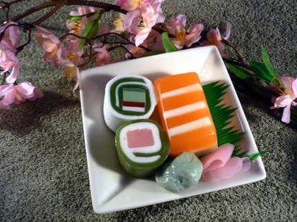
This second item made me metaphorically $0.02 richer. I love sushi! I would eat it breakfast, lunch and dinner if I could. I even claimed that if I had to pick one type of food to eat for the rest of my life, I might gladly pick sushi. There's something about not only the light taste that leaves you satisfied but the art that's involved in its creation.  

Having said that, imagine my excitement when I see art imitating life, and life taking form in art as sushi soap! Etsy shop, Bunny Bubbles has some great creative soap creations that are beautiful works of practical and useable art. The delicious bars of soap are even matched in creativity for their scent, each baring a unique combination of distinct asian flavors which adds an extra layer of continuity.

This is the kind of thing I want to have in my home instead of buying factory made, masses-to-the-billions brands of soap like dove, and ivory. Soaps whose ingredient lists that might baffle a chemistry major,  the same ones that the super-store shelves are teeming with are ones I wish weren't as available, convenient and affordable. I'd much rather support great artists. Their products are most likely safer to use especially since they are handmade with natural ingredients in a more organic way and I use that word cautiously as I don't mean the way most big corporations have simply turned organic into a brand or marketing tool. I'm talking about the way in which it was created, a much simpler process by the hands of a professional whose passion and gifts compel them to craft even the most practical items. This is how it should be, don't you think?