navbar

Tuesday, September 21, 2010

Litho love

Lately trying to find time to blog has been like trying to catch a snowflake on my tongue. I've decided to stop making time an excuse and just keep them short.
While checking the weather this morning my homepage, fffound pointed me to an interesting site Gig Posters. It particularly sparked my interest because I'm currently taking a lithography class and although I've only had 2 classes and didn't even fully understand what the process was when I started, I've fallen in love with it. I'll post some process pics, prints and blog soon ;)

found on fffound :)


Monday, July 19, 2010

Smile :)

Do you ever walk past an inanimate object and realize how much it resembles a face or a body part? Often you'll find that a lot of objects, having been designed by humans, will aesthetically relate to our physical attributes whether conscious or not. It must be something we can't help but doing. Our egos dominate a generous part of our minds which kicks into play during this (or any) process, creating resemblance to what we know best, ourselves.

I find discovering these resemblances are usually amusing yet short-lived moments. It's like if you visualized the joy of a great idea as an incandescent light bulb (a common analogy) and compared it to a small LED light. I find human features, often faces, in almost anything like wall plugs, cameras, shoes, lamps, you name it and I do this with more ease than any word search, or Where's Waldo.

One of the most common things that will often glare back at me with an undeniable character-filled face is the front of a car. They roll around town with a twinkle in their bright headlight eyes, and some of them will even beam a smile at you or expose their teeth through their grille, which only brings to mind a flashy hip-hop trend of bedazzling (sorry, I meant blinging out) your teeth from 2005 and the song that started it all, Grillz, by Nelly. But I digress.

The other day, when I went to see Despicable Me, I found the biggest and happiest grin I've ever seen on a car that it would even have the Cheshire cat hissing in envy. The new North American Mazda2 has to be the happiest car I've ever seen. So much so, that in my excitement, I inadvertently turned to Danny and said "The car is smiling!" This brimming car was born for this and has clearly been designed to capture the hearts of cute-seekers all over North America and it even has a cute little green robot sidekick. Smiley over here (the Mazda), will mostly likely captivate the unsuspecting souls of their target market of trendy young adults (18-25) mostly females, it certainly did the trick on me.

I do however, find it interesting that the cute-seeker approach was only applied on the North American model. When looking at the Mazda 2's launch site which directs you to specific countries, it seems Canada and the US are the only ones with the smiley car. It just goes to show that culture must indeed have a substantial effect on design. Psychological features like the smile might work on us, or maybe even in parts of Asia but apparently not in Europe.

Like I said, I like it :) Maybe it doesn't help that I'm a young Canadian-Korean female who really likes cute things but I also appreciate the design.

Tuesday, July 13, 2010

I miss the freedom

As much as I love the routine of full-time work and having a reason to wake up early in the morning, I definitely miss the freedom of unemployment, but mainly just being able to keep up with my blog. It's been quite a little while since my last post and the guilt has started to set in. Considering I've slept in a little longer than I should've and that I'm sacrificing "get-ready" time for this posting I'll keep it short and sweet.

Here is one of the best ad spots I've seen online in a while, fwd'd to me by someone at the office. How brilliant to use the loss of Bosh as a creative opportunity to poke fun at Toronto while promoting flights.


Yeah, you do deserve it, Toronto!

Monday, July 5, 2010

Post No Bills

After being sent home due to the rolling black-outs, I left work at King and Bathurst to meet Teri at Queen and Spadina, only to realize there was nowhere to do anything since nobody had power. Regardless, I'm still glad that I trenched through the heat for what felt like an endless distance due to the smoldering heat. Other than having met my friend (however brief our meeting was), the trek was made worthwhile because of my surroundings. The area is so full of art, culture and life even in the simplest way.

It lives in walls, behind windows and doors, on the streets, on store signs, and even as graffiti. There were quaint, and quite obviously tight shops where I could just hear the stories of all the unique items. The tales of the antique's previous lives whispered past my ears like a piece of shared gossip walking past me. Bike shops, whose bike residents looked like a much more heroic feat of ingenuity than that of any that you might find at a larger wholesaler. Bright murals along alley walls, handcrafted jewels adorning storefront windows, fabrics majestically draping down shelves in textile stores, it was all so refreshing in a familiar and almost redundant way and yet I was so happy it was all around me. Maybe it was the heat.

Amongst it all, what stood out the most was definitely the image you see posted below. It orders "POST NO BILLS" and in one swift, witty yet defying manner four infamous Bills have been posted: Clinton, Murray, Gates and Cosby. It's undeniably reminiscent of the work of my favourite graffiti artist, Banksy and only makes me wonder if it was in fact his work. This might just be a little wishful thinking but it is simple and witty enough to bear its identity as a Banksy piece yet since there's no definite indications yet, for now it will remain anon.


Saturday, July 3, 2010

Inspiration: Mountains of Sushi

Like the charm of finding change on the floor here are two very different things that have been like finding lucky pennies along my path.


My First Penny

The first is the work of Joseph Blalock whose logo / identity designs are so articulate they take you for miles of communication all in a moment. Its subtle eloquence makes I appreciate it that much more. The logo that stopped me in my tracks was Iron Mountain for a document management firm. It's so brilliantly straight-forward and simple.

What a great solution for the logo, it makes me wonder what his process must've been like to have discovered the resemblance and to have visually transformed the subject so powerfully into the name. Now, I'll always relate the two.

It brings to mind the FedEx logo, my all time favourite logo. It has the ability to speak about an entire company's identity and encapsulate it into an icon. The FexEx logo is stripped down to the bare principles of typography and graphic design: letters and space. It's like being rationed your food for survival, and yet it triumphs as such a prosperous logo. Through the use of the negative space between the capital 'e' and the 'x' they've fully taken advantage of the space by allowing the space in between the two forms to create a new form, an arrow. The arrow adds a new dimension to the logo and speaks about direction, movement, speed, and intelligence in a way like no other. -- This is why I love it. 

Ad found on an AdRants blog


Second found penny

This second item made me metaphorically $0.02 richer. I love sushi! I would eat it breakfast, lunch and dinner if I could. I even claimed that if I had to pick one type of food to eat for the rest of my life, I might gladly pick sushi. There's something about not only the light taste that leaves you satisfied but the art that's involved in its creation.  

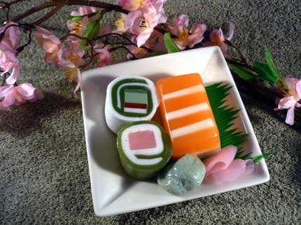
Having said that, imagine my excitement when I see art imitating life, and life taking form in art as sushi soap! Etsy shop, Bunny Bubbles has some great creative soap creations that are beautiful works of practical and useable art. The delicious bars of soap are even matched in creativity for their scent, each baring a unique combination of distinct asian flavors which adds an extra layer of continuity.

This is the kind of thing I want to have in my home instead of buying factory made, masses-to-the-billions brands of soap like dove, and ivory. Soaps whose ingredient lists that might baffle a chemistry major,  the same ones that the super-store shelves are teeming with are ones I wish weren't as available, convenient and affordable. I'd much rather support great artists. Their products are most likely safer to use especially since they are handmade with natural ingredients in a more organic way and I use that word cautiously as I don't mean the way most big corporations have simply turned organic into a brand or marketing tool. I'm talking about the way in which it was created, a much simpler process by the hands of a professional whose passion and gifts compel them to craft even the most practical items. This is how it should be, don't you think?

Saturday, June 26, 2010

Arrestingly triptonic inspiration!


I never intended to blog today to be honest, but as I was perusing for inspiration I came across an insanely interesting music video by Anthony Francisco Schepperd, that needed to be shared: The Music Scene (song by Blockhead). Had I heard the song on it's own, I think its intentions would've been lost on me for it is the video that imprints such a deep incision of significance and inspiration in my mind. Right from the start the images Schepperd paints stops you in your tracks arresting you to watch on, doing exactly what the video is speaking about. I interpreted the message that TV and other forms of media suck us in with they're visually arresting images and hypnotize us into ignorance among other things. The irony lies in the fact that the video itself sucks us in leaving us to want more.

We become so consumed with the media and everything it feeds us that not only does it become eyes into our lives and thoughts but in turn creates who we become. It roots itself so far into our existence that we depend on its energy and fail to see the beautiful natural energy that surrounds us, slowly depleting our life supply. We have given life to technology, and in turn technology has given us new life, destroying our old organic lives along the way. The dim, insincere light of the screen illuminates our artificial lives until there is nothing left to live for, until we burn out.

I watched this video several times and only want to keep watching it as I learn and discover something new each time. It reminded me of why I decided to cut TV and background music out of my life as I first posted about several weeks ago. It has renewed my will to only watch what will positively inspire me, not simply allow commercials sit in the background pouring unwanted messages into my mind.

Thursday, June 24, 2010

Peacocks and polywash

I'm both mesmerized and awed by the work of artist Laurel Roth. The mixed media sculptural series "Peacocks" mimics their mating ritual by borrowing man-made, figurative peacock feathers: cosmetic supplies. Ranging from fake nails, fake eyelashes, to barrettes and jewelry, Roth has created gorgeous life-like peacocks. To me it speaks volumes about how humans relate to these beautiful birds in that we seek to impress, and when our feathers are simply not shiny enough we cock our heads high and fake it to make it. We may share vanity but it's natural beauty that peacocks loom over us and our creativity that we loom over them, what a fascinating relation.

Wednesday, June 23, 2010

Meet Clarice

I found her on Etsy and though I don't know much about vintage cameras I thought this would be an awesome opportunity to learn more about photography. It's difficult to find simple technology lately where you can count the pieces involved in its structure on your fingers and toes. In an over-complicated world, something this simple can bring you a lot of peace. I probably paid a little more than I could've considering they're probably waiting to be discovered at flea markets and garage sales but I guess that's the price of convenience and my first lesson learned. Regardless I will consider her a great new addition and can't wait to give her new life.

I found the ol' girl at the Falcon and Finch Etsy shop and though Lynelle has a great choice of cameras in her shop, there was just something about this vintage six-20 Brownie "E" that captured me. Now I just got to get my hands on some 620 film and I can start experimenting. Brace yourself world, here I come with a brand old camera and a whole world of moments to distill.

Monday, June 21, 2010

What the font?

I realize my title is an already existing web app by myfonts.com that helps you identify fonts, but it's just too perfect that I couldn't pass it up as a title. -- Props to the copywriter who thought of that one. 

Today my goal is to lay the groundwork for publishing my two beloved fonts, Coalescent and Fingerprint. Essentially I want to sell them so I need to know how to properly license them as well as find websites that will host them. I would hate to see my lovingly created fonts sit dormant on my hard drive waiting for the day I need to use them for an appropriate project. I'd much rather see them put to good use. Here I will log my research on how to publish and sell fonts. 

The first useful article I found was Font Licensing and Protection Details. It goes over basic font use and licensing and I learned that whenever a font is acquired (purchase, downloaded as freeware, etc.), the user is bound to the end user license agreement (EULA).  Essentially this means that they cannot distribute or share the font with other computers even if owned by the same owner, unless specified in the license. Apparently I also need to consider how to protect my fonts. There are trademarks, design patents or copyrights. Trademarks only cover the name of the font forbidding anybody to create a font under the same name. Design patents, though they are the rarest due to cost and effort, protects the physical anatomy of the letter forms and design. Then there are copyrights which are apparently "the most commonly used type of protection, but has also been the most vague and difficult to enforce." Essentially fonts files (TrueType or PostScript) are considered computer software and are protected as such. 

Now that I have some background knowledge on font licensing, Where can I host my fonts? What are my options?

Dafont.com does allow you to submit a font which will then get evaluated and the author is then notified if it has been selected for them to host. It seems the EULA is to be provided in the zip file along with the font. The only disadvantage is I'm not certain how much of the font dafont is allowing itself to my font and can potentially own it, and there is no option to sell the font, since all their fonts are free downloads. 

MyFonts.com also has a seller section. According to them they have the largest selection of fonts and participation is open to all foundries, large or small. They offer 50% of the retail price whenever the font is sold. They look really reliable and offer many opportunities to market your font as well as protection of rights. It feels more like a retailer of fonts. I'm not sure how to get started and I would have to assume there would be an application process.

Linotype.com invites designers to submit fonts as well. Sounds awesome but I feel like I might be a little too grass roots for that just yet. It also seems like the fonts they sell are a lot more practical and mine are very much for display use. However they are a far more recognizable and reputable company within the industry and also lists help in preparing your font for submission. I feel like this would be a lot more official than other sites as they offer to license your font if accepted. 

ITCfonts.com is also a recognizable name in the font industry that accepts font submissions for licensing. However there requirements seem a lot more specific and a little less helpful. Somehow, as similar as they seem to other sites, they don't seem quite as appealing but that could just be my initial impression.

For now I've decided to prepare my fonts for final submission and gather a little more info from each company. I will then weigh out my options and will most likely submit the fonts to a couple sites almost like applying for a job. Maybe I can also host and license the fonts myself through my website.


A great new resource for fonts was forwarded to me by Jan. Type For You, a great typography blog with an awesome directory that opens up a lot more possibilities.  Thanks :)

Saturday, June 19, 2010

my creepy stalker

This morning when I woke up, I pulled open my blinds to open the window and let in some fresh air. As I laid in bed on the phone I looked over and winced a little as I noticed this creepy little visiter just chilling on my window. He's a bit orange in colour with six legs about double the length of his body spewing from his sides. *shudder* Overall he's about two inches in diameter including his legs and I've decided to call him Gordon (I like naming things).

Bugs can really creep me out. Even when I just see one on the side of the street, I yelp a little as I cautiously walk around it. My initial thought was, "oh dear, is it inside or outside." The answer, thank God,  is outside. As much as I don't like insects, I am trying not to harm them because they are all living creatures that contribute to the ecosystem. And plus, I don't particularly like the squashing feeling beneath my finger through the tissue but sometimes it happens instinctively.

It's afternoon now, and through wind and rain he's still on my window. As unsettled as I am by his harmless yet creepy stature I'm also quite fascinated. It's a little like a good horror flick, you know you might shit your pants, but you're still watching for the thrill. I thought I would take this as a creative opportunity and make a little horror poster out of him.


Friday, June 18, 2010

If you can read this, I can't see you

The other day as I was riding my bike home, I passed the truck loading area on Comstock which was laden with trucks loading and unloading their stock. I'm not going to lie, it was a little frightening (but maybe that's because I am pretty chicken about most things), so I made sure to slow down, check the road for oncoming traffic before crossing into the next lane, made eye contact with the driver who had just popped into the driver's seat and cautiously made my way past him. As I continued on my way home I thought of the "If you can read this you're too close" bumper stickers. It made me think about how redundant the copy on the sticker actually is. You figure, if you are reading it you simply are too close for your own safety but the time it might take you to read the sticker, you could've already been hit.

Essentially, the person whose life that sticker intends to save, is now required to take the time to read the obvious, that you are reading the sticker. Why not just get to the point? I don't really need to know that I'm reading something, but I do need to know I'm too close for my own good. The fact of the matter is, the truck is so large that there are blatant blind spots within which the driver simply cannot see. This means that for one's own safety, one should always keep a great enough distance. The problem is, this might often be forgotten or simply unknown and a bumper sticker like this has the potential to save a few lives, if only it was designed more efficiently.

I say get rid of the old "if you can read this..." and get to the point: You're way too close you idiot! In all seriousness, I've redesigned the sticker just for fun.


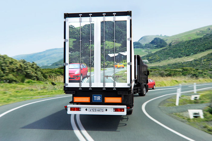
On another note, while searching for images of the original stickers I came across an article, "Transperant Truck System Could Save Lives" which was originally posted by Gizmodo and Engadget. It's absolutely genius in its simplicity and practicality. It's unfortunate that the technology is apparently too costly to put into effect on all large trucks. The system called Transparentius, designed by Russian design studio, Art Lebedev, is simply a camera in the front of the truck that projects what is ahead on the screens built-into the rear doors of the truck. This way, driver's behind the truck would be able to safely pass or switch lanes.

It's funny how the technology is supposedly too expensive to actually implement yet if the screens were to be used for advertising they'd already be in place. They can spend the money downtown for some LCD billboards or LCD screens anywhere else you go, like in malls, or even the theatre yet saving lives seem to come last on the priority list and isn't worth the investment. It's just too bad there aren't more people dedicated to bettering or even saving the lives of others than making money.

Tuesday, June 15, 2010

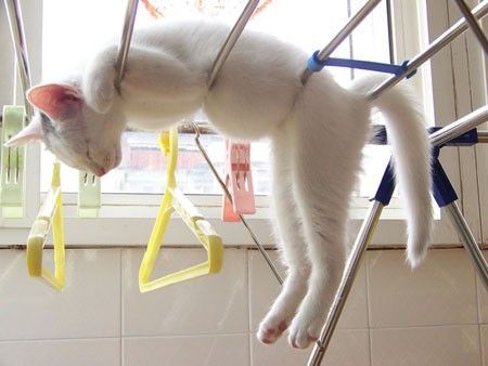
hang in there kitty


This just makes me smile! Found on ffffound which was posted from Tumblr somewhere

i miss you - love is real

I woke up this morning after a night of fiddling around with the previous image I posted but still couldn't get just right. I realized what was missing, an extremely real person I love and miss. So here is my new rendering of the quote.

Monday, June 14, 2010

realize life


"Love is the extremely difficult realization that something other than oneself is real."

I think about all the people and things throughout my life that I've been fortunate enough to know and love and this quote only becomes that much more clear. When we love someone, we let them into our world and get to know theirs. We share our lives and understand each other. Building friendships and finding people to love like family and friends is the most rewarding challenge in life. We may not always get along with our loved ones but riding it out and being there in their time of need is the fruit of true love. It is the most overlooked yet essential part of life and can determine who we are and who we become. We let ourselves get so wrapped up in occurrences and the values of the material world that we neglect the well-being of something so organic, simple love. When I read this quote yesterday, it was such a simple yet revealing truth about love that it reminded me that life does not have to be complicated.

Love is realizing what's real and life is reality, so love life.

I created this simple piece in appreciation of this quote by British author and philosopher, Iris Murdoch for articulating such a beautiful truth. I want to realize the world and love what's real. 

Zoidberg my friend, is that you?

Found this great illustrator, Joseph Crocker, on iconology. This awesome yellow, red and black piece to the right caught my eye in an instant. I don't know if it's because my TV deprivation makes me really miss Futurama but the illustration reminds me a little of Zoidberg. All that aside, I love the flamboyancy in his expression but also in the bright yellow and red contrasted against the black. Even the lighthearted movement of the lips, I originally interpreted as tentacles, makes me hear their voice. There are miles of personality in such a simple rendering of this character.

He has a splendor of other amazing pieces as well, many portraying a rainbow of characters. Some of them even have a Picasso-esque influence because of the twisted perspective. They all seem to tell a story which is what might be so intriguing. Individually, the illustrations gave me a sense that they could be compiled as an illustrated book (especially because one of them actually reminded me of the illustrations in kid's books, Mr. Men) and as it turns out they are apart of his book for Nobrow called 'Vedoin'.

Basically I admire his distinctive style.

Sunday, June 13, 2010

TODO - business cards

First round of business cards are done. They are very simple and based on the design of my website, but just like any creative work I don't know how satisfied I am with the overall identity. My logo and site design were created in order for me to have a structure to build around as to not further hold me back from going live with my site. Now that it's up, I'm contemplating making it a little more shinister. We'll see where it goes. For now here are a couple screenies of the biz cards as they are right now however, the differences are not very drastic.


thanks Terr bear

Teri's FB response to an older response. I really liked the article so I thought I'd post :)

The Importance of Personal Projects

Here are a few ideas for upcoming personal projects:
- series of handmade greeting cards
- series of screen-printed Beattles posters
- photo journal of morning bike rides around Toronto
- buttons m.i.a (missing in action not the artist)

Why is it that the best ideas stampede through my mind when there's no way of writing them down, yet when I'm ready to list them I draw blanks? Note to self always carry pen and pad!

wall and piece

In need of inspiration today, so I made my way over to Banksy.

Saturday, June 12, 2010

gorgeous glass

In my morning quest to build my Etsy empire, I decided a good place to start was to find inspiration. As I am quite new to Etsy, I'm still learning the language of it all. What can I sell? How do I market my shop and items? How do I market myself? Of course, through it all, I found myself hopelessly window shopping since I really should not be needlessly spending my almost non-existent money. Unfortunately, no amount of rationalization could erase the guilt of pushing that "add to cart" button, so I opted for the "add item to favorites" button instead. It's like the difference between the a shot of cold water and a shot of vodka, one is nourishing but not quite as thrilling as the other, leaving you with a spinning sense of anticipation.

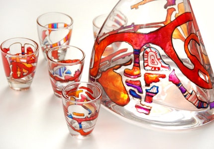
As I strolled through the shops, however I found a gem within the blogs. It was a great how-to article by artist, Yevgenia, who loves to paint gift items for her family and came across this technique of painting on glass when drawing for new gift ideas for her father. I love how creative and sentimental her motives are especially since I am a strong believer that gifts of value come from the heart. Whether you are artistic or not, everybody has the ability to create something meaningful, be it art, crafts, poetry, or even moments. A gift should not just be the hottest gadget or items in high fashion magazines, but something that relates to the receiver and the giver.

Since many of my friends' birthdays are coming what better way to practice this new-found artistic technique. I will create a set of 3 shot glasses for each of my friends' birthdays. I'll need to start sketching personalized designs now so I can buy the paint colours I'll need. It's the perfect excuse to learn a beautiful new art form and I couldn't be more excited. Yay.

Friday, June 11, 2010

TODO

I won't have much time to blog today as I am setting out to accomplish some goals:
- learn how to properly embed my blog to my website
- finish business card design
   - set up for print
   - request quotes from printers
- finish design for mail-outs
   - set up for print 
   - request quotes from printers

I have a couple of hours to get it all done before work. The biggest challenge will be to keep my A.D.D in check.


***
update...

I was only able to embed my blog. It took a lot longer than I thought it would. Damn, finicky HTML. But I got it done. I tried to sync the overall aesthetics with my site as much as possible with the little newb-knowledge I have of blogger. Thank God for Google. That should be the new TGIF... TGFG. Just sayin'

off to work I go.